So often, we’re drawn to neutral colors when it comes time to paint our homes, both exterior and interior. White, black, beige, cream… sure, there’s something to be said for classics. But why play it safe when you could make your home the most unique on the block? Your home is a canvas. Give it a touch of color here and there. Go bold with the front door, or paint your bathroom a color you love. Be an artist, and your home will be more than just a “home” — it’ll be a work of art. We’re breaking down all of the colors you need to make your home special.
Interior
Oranges, Reds, Pinks
We associate warm colors with comfort. Think of the reds, oranges, and pinks of sunset and all of the feelings those conjure. You’re on a beach, wind in your hair. You’re watching a gorgeous sunset. You’re at peace. This is how you could feel in your own home. Warm colors are excellent choices for rooms you want to feel, well, warm. Living rooms, family rooms — where are you looking to spend the majority of your cozy time? These rooms deserve your sunset colors. Just make sure you don’t get so much sun in these rooms that it competes with the paint colors.
Soft Yellow
Yellow is often considered the “gender-neutral” color for a baby’s room. It’s a great color for babies, as well as children. It instills a sense of calm, which is perfect for a child’s bedroom or playroom. It also pairs well with a variety of colors. Add some touches of navy or a few cream accents. This is a relatively neutral color that packs a big punch.
 Purple
Purple is a color with a big personality. Sure, there are many shades, but it’s generally a loud color, which makes it ideal for small spaces — a mudroom, entryway, or office. You could even just paint a portion of your wall in purple and consider it an accent piece. It’s a fun, playful color that will brighten up your home (and day).
Dark Teal, Navy, Green
Dark colors are super in right now. They give rooms character and create a space’s mood. Contrasting dark colors with lighter trim is a great way to add texture to a room. When it comes to interiors, these colors work best in slightly bigger rooms — otherwise, they may make a room feel cramped. Consider dark teal for your dining room or navy for your living room. A lot of homeowners are also going darker with their exteriors. Again, accenting a house with lighter trim can really make it pop.
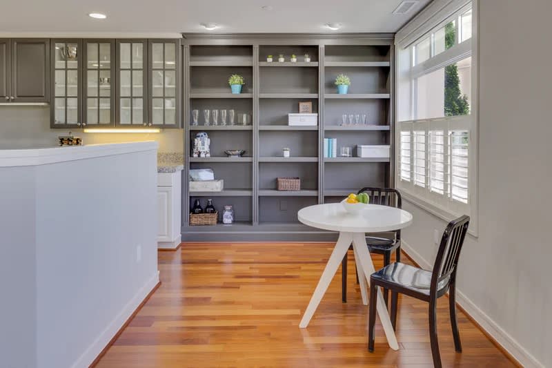
Gray
Gray — more specifically, “Ultimate Gray” — is a Pantone Color of the Year. And, when it comes to homes, it’s definitely worth exploring. This color is great for a kitchen. Paint the cabinets gray and pair them with burnt yellow walls. The gray will add a sense of function to a bright room and also pairs well with eye-catching hardware.
Blush Pink
Many homeowners are replacing what would have been white walls with light pink or “blush” colored walls. This color achieves the same versatility as white without seeming too boring or neutral. It’s also a comforting color, making it a great option for cozy rooms.
Brown
Brown is going to dominate this year’s color schemes. It’s not as neutral as white and not as dominating as black, making it an excellent wall color for bigger rooms. It can have a regal air when paired with ornate accessories.
Mint Green
Mint green is fun and tropical. Paint an entire room or choose an accent wall. This color looks great in a variety of lights, so consider putting it in a room where there are lots of windows. The natural light will transform it throughout the day.
Clay
Natural accents are in for this year. Repurposed wood — tables, bookshelves, art — brings the sustainable calm we all need. Clay is a great color to accent these natural pieces. It’s neutral without fading into the background. It has hints of coral but isn’t bright, so it’s excellent for a versatile room.
Exterior
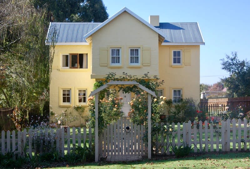
Yellow
Yellow is a great option if you want your home to look bright and welcoming. It’s also a rare color, meaning you’re guaranteed to stand out on your block. Just be cautious when choosing shades — light yellow tends to do better on the housing market because it’s a more approachable color.
Navy
Navy is making a comeback. This is a bold, stately color with a lot of history. A navy house has a very 1920s feel. It pairs well with yellow or orange accents and will automatically give your home a fun, art deco vibe.
Oxford Gray
Oxford Gray is a classic color, great for Colonial homes. It’s relatively neutral (but certainly not boring) and looks great with an off-black door. The combination is striking and looks very put-together.
Bright Front Door
Orange
Gone are the days of neutral front doors. Many people are accenting their homes with doors that pop, and nothing pops better than orange. If you’re repainting your entire home, consider choosing a bold turquoise or blue to compliment the door.
Coral
Coral is a great blend of soft and loud. It’s unique because it’s not quite pink nor orange. It pairs wonderfully with neutral colors, like beige, tan or white, as well as louder colors, like yellow.
Red
A red door is a classic with a twist. Nothing says “stately,” like a white home with a red door.
Pink
Pink is friendly and upbeat. A home with a pink door says, “visit me!” It brightens up even the most neutral of colors, like white or brown.
Light Green
Light green is an excellent choice for mid-century homes. It compliments neutral greys or whites but makes for a more modern look.
If you’re looking for houses for sale in Ponte Vedra, contact KMF and JMF Real Estate. Kim Martin-Fisher and Jennifer Martin Faulkner look forward to helping you find a home you love.